Enterprise AI Suite to provide seamless and efficient AI Research and optimize usage of computing resources
Impact
Yennefer Suite is 5 in 1 enterprise AI platform that serves AI search to get valuable insights from massive data and manage an organization's AI projects. I was the only designer in this startup company and led the entire design thinking process from research to launch. Currently, Yennefer is being used by 9 enterprise organizations including Samsung Display, KT Telecom, Hyundai, Seoul National University, and the State University of New York.
Teammates
My Role
Increase in company revenue
Increase in AI research efficiency
Enterprise companies using Yennefer Suite
Duration
Platform
300%
91%
Overview
UX Research
Interaction Design
Prototyping
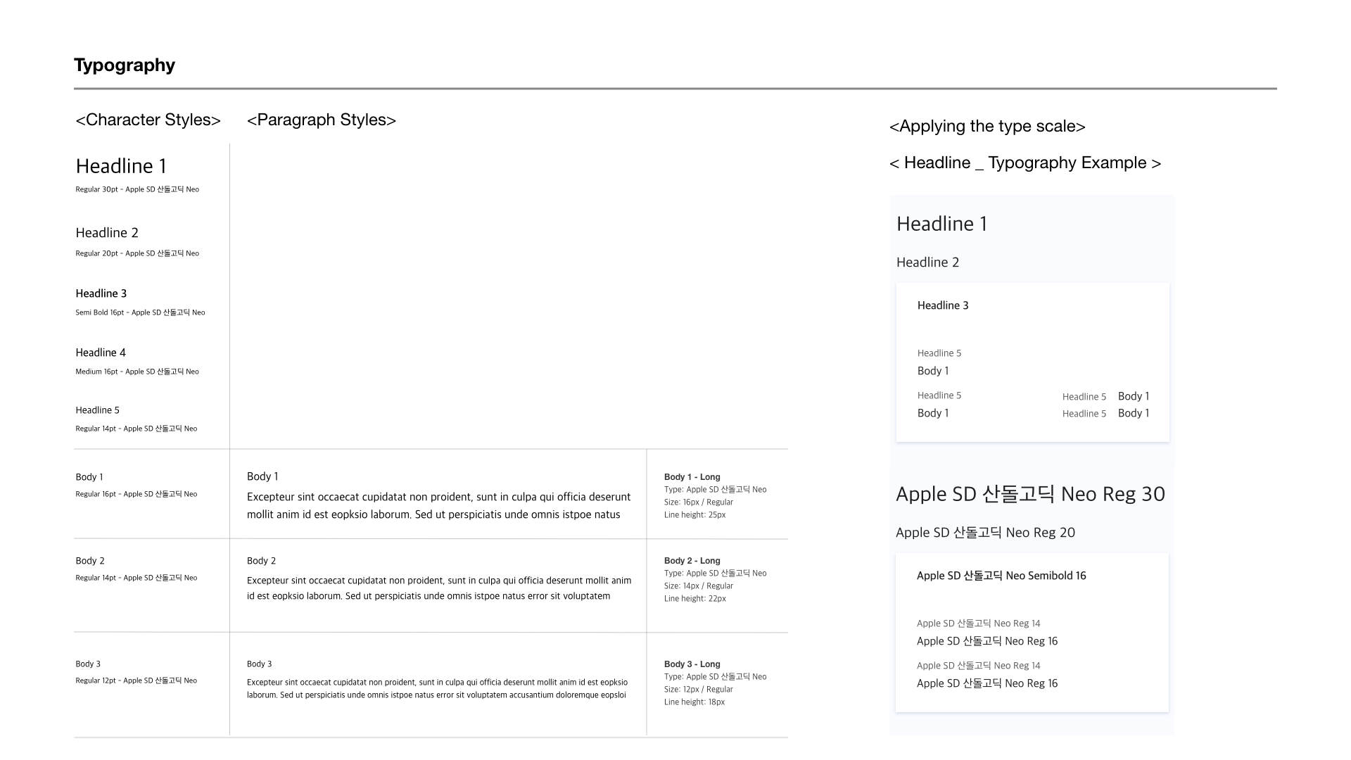
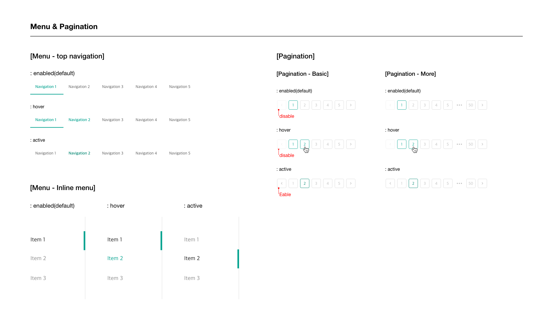
Create Design System
Usability Testing
Product Designer (ME)
UX Designer
4 Developers
CTO & CEO
8 months in 2020
Desktop Web
Dashboard
9
Background
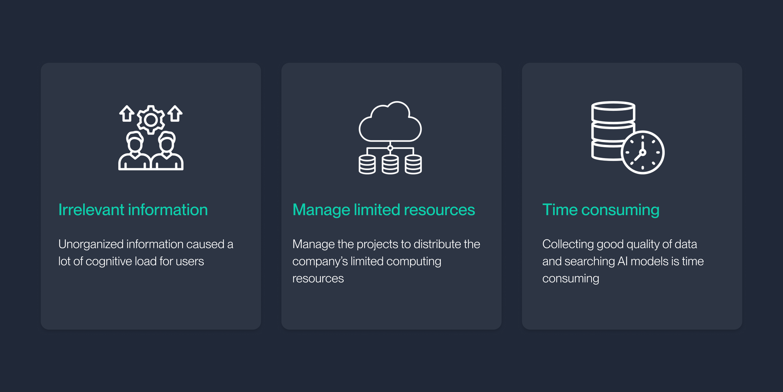
The company’s half-made prototype which had lack of features that are crucial for AI Research. Especially, gaining AI models/data and managing AI projects from different platforms was chaotic and time-consuming.
The company’s prototype was created by a developer without UX research. Therefore, important features are missing and not defined. Furthermore, there is no consistency for each page.
The company had a half-made prototype without understanding the users
Final Solution at a Glance
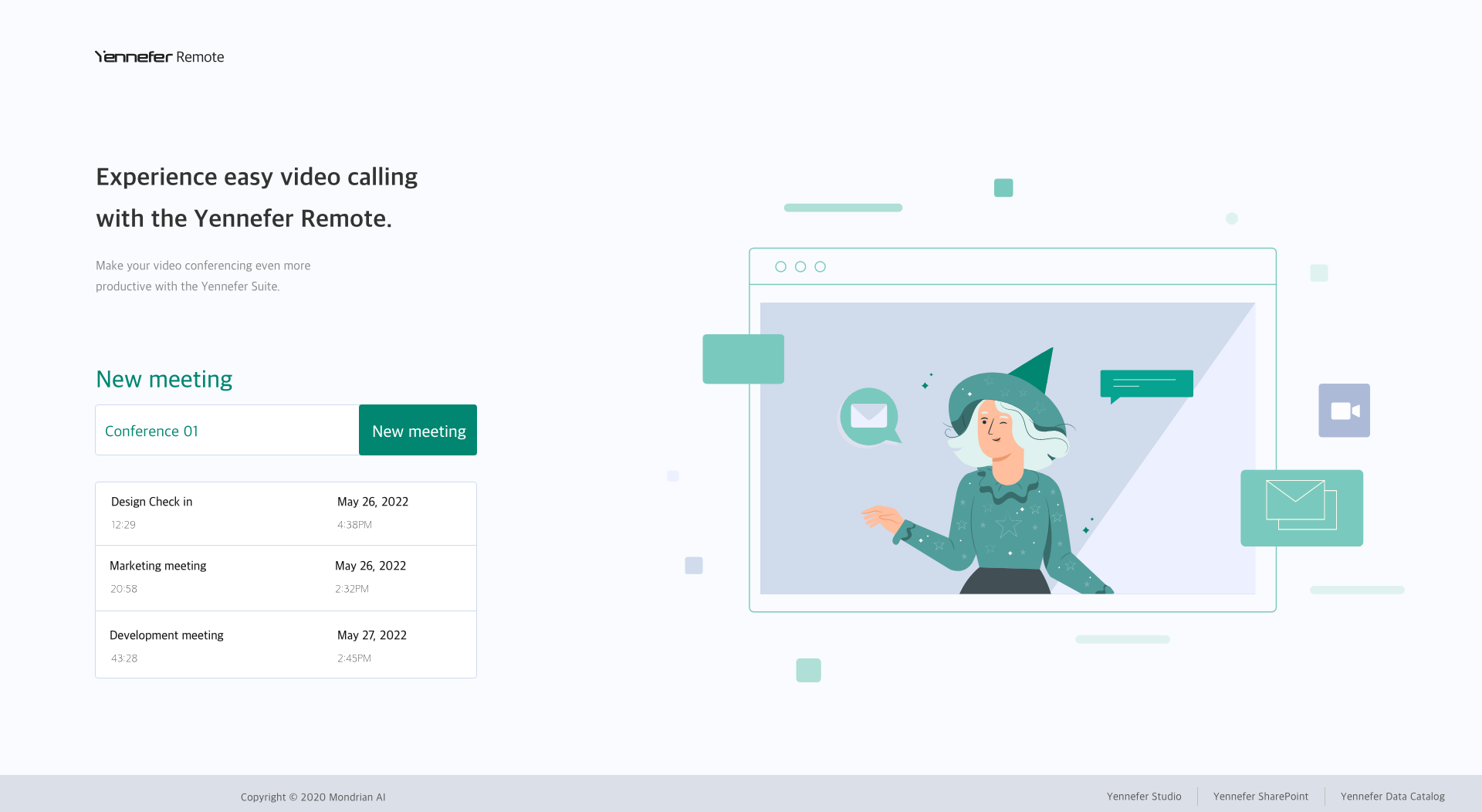
Created an All-in-one AI Suite to help AI researchers easily develop, test, collaborate, and manage AI applications by adding computing resources. These platforms include a development environment(IDE) for AI research, a seamless data hub for easy access to data and AI models, and a data visualized dashboard for resource management.
5 Products in 1 Platform
How does Yennefer work for AI Researchers?
E2E Design Process
Research Overview
I used 5 user research methods to understand the project’s goal, the enterprise AI platform’s trend, and AI researchers’ pain points. I aligned with our product management counterparts to develop design roadmaps and research plans.
Heuristic Evaluation
I performed a heuristic evaluation for the initial 10 pages wireframes named AI Playground. I test-drove developer tools and analyzed them based on the NN group’s 10 heuristic criteria.
10+ User Interview
I interviewed AI researchers to look at the problems from their perspectives and experiences. I defined personas to ask key questions from varying perspectives. Then, I leveraged the personas to draw up user profiles to best find and explain pain points and then reframed them as opportunities for solutions.
20+ Competitor analysis
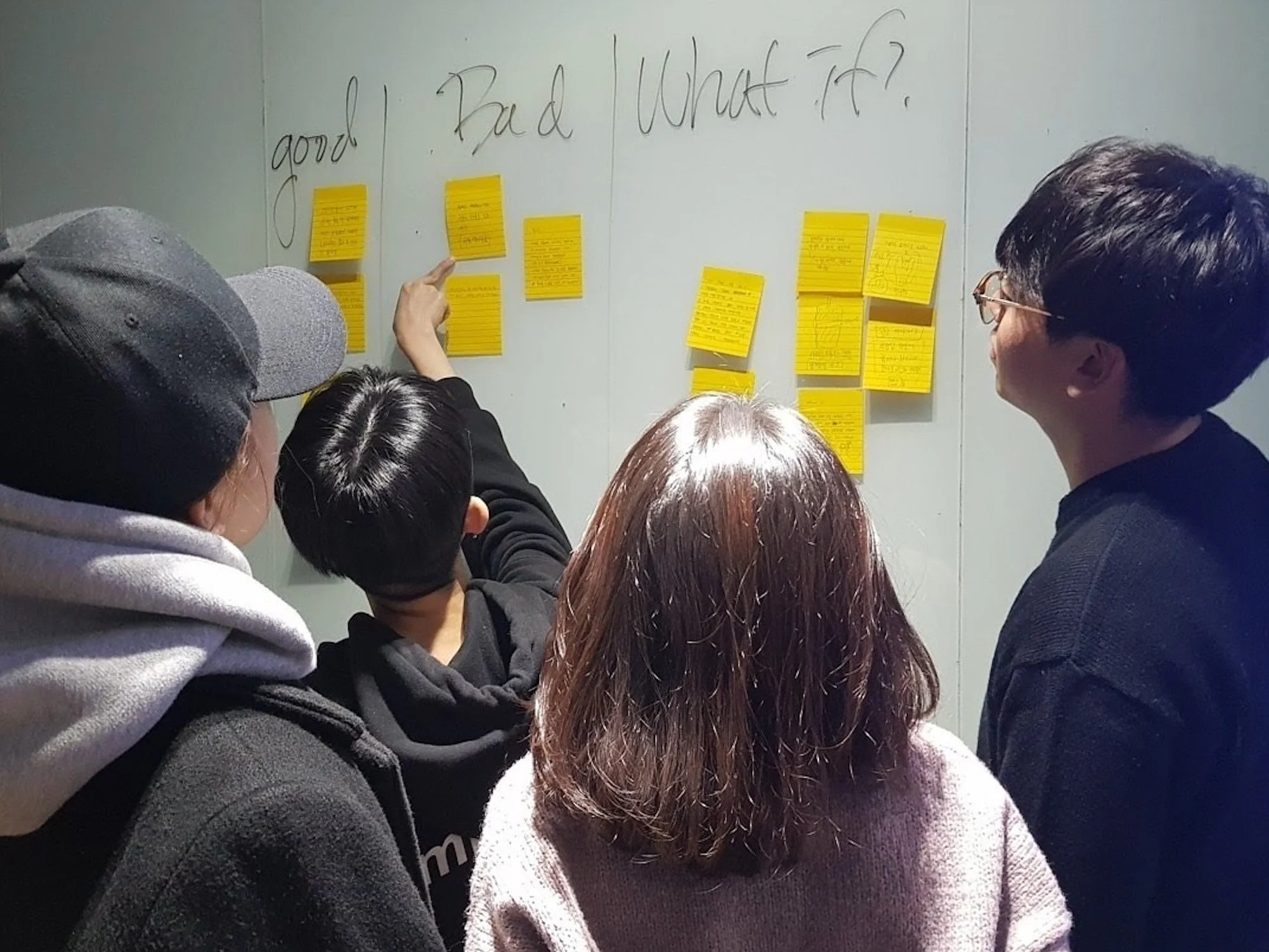
After gaining all the quantitative and qualitative research’s key findings, we performed the affinity diagram to find patterns. We found 8 main problems in AI research. Finally, we decided to focus on 4 problems to solve.
AI Researcher’s Pain points
Target User
With these findings in mind, we converted the key problems into 3 opportunities to solve during the design. Furthermore, we defined two personas, AI Research and manager.
Design Goals 🎯
Easier access to data/AI models
Get a glance at the projects status and computing resources
Support multiple
platforms & Persona
“How can we enhance the AI research experience by simplifying access to and management of resources?”
To answer this question, I set three design goals to create a holistic AI research platform. During the design process, these principles should be prioritized and followed to create manageable and accessible projects and data.
Challenge 1: How to get a glance at the project’s status?
Design Iteration🔁
Based on interview findings, we defined the crucial information to get a glance project status.
The new platform went through many iterations before we had a shippable design candidate. As I unify platforms to one product, I added project lists and statuses, accessible data, and documentation ideas into the core wireframe and created a quick design prototype to test. After validation, I improved the design.
Design Decision
1. Quick scan project status on the main page
2. Easy access to current project information and description
Challenge 2: How to easily manage computing resources?
Pros ✅:
The chart has the proper size for width and height to understand the data
Cons 🚫:
Computing resource data and charts are not aligned, so it’s not intuitive to understand
Pros ✅:
Computing resources data and charts are aligned, and easy to understand
Cons 🚫:
The chart’s width is too narrow to scroll the past history or see the overall status
Pros ✅:
A wider chart’s width helps easy to scroll the chart
Computing resources data and charts are aligned, and easy to understand
Followed the F-Pattern interface which is the most common user eye-scanning patterns
Cons 🚫:
The chart had few Y-values, so it’s hard to see the detailed chart
Option 1
Option 2
Option 3
Software Engineer 🧑🏻💻
Since we designed the responsive website, when we open the sidebar navigation option B will be too narrow to see all the information.
Product Manager 💁🏻♀️
Providing a sort option based on period could be helpful to understand project status. Option C’s wider chart width will be easier to scroll and access data.
Design Critiques & Feedback from Stakeholders
Design Decision
We wanted to create an intuitive UI that is easy to scan to manage projects. Based on our design goal, option C could be the most reasonable. The reason is users can get overall history graphs, and the content layout is matched with the user’s mental model.
Option C
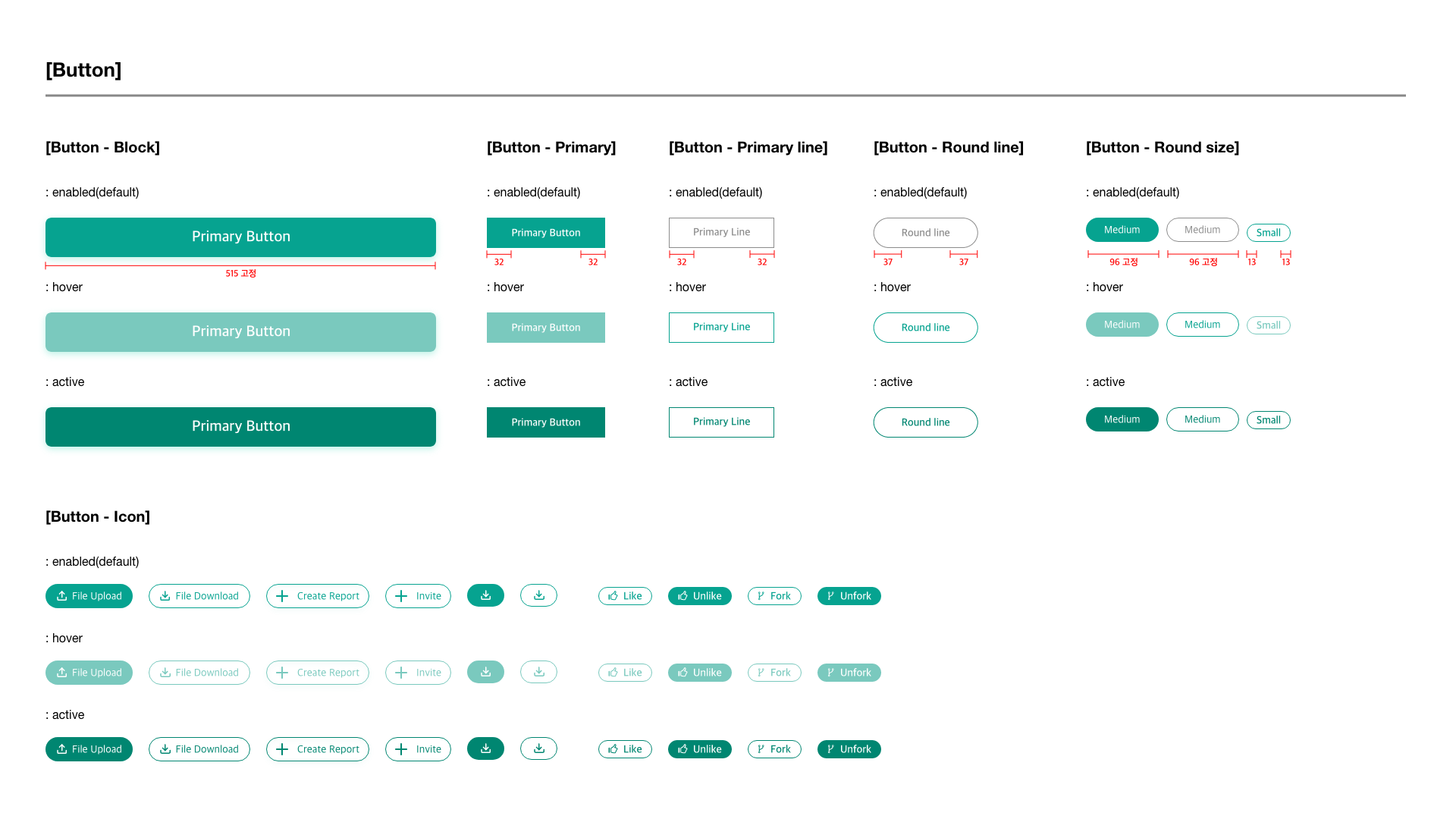
Created Design System
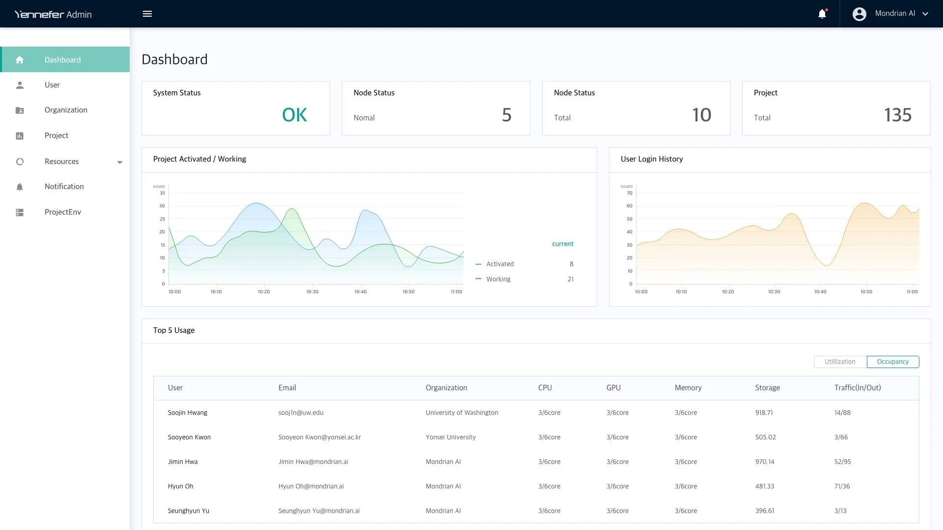
Admin Dashboard
1. Intuitive Data Visualization
We created the data-visualized Admin dashboard from text-based information.
Users can use limited data efficiently with the Admin dashboard by tracking the resources, sharing
and managing the individual or incorporating data, and authorizing the collaborators’ role.
Before
The previous prototype had insufficient and unclear information to manage the projects and users. Text-based information was hard to understand resource usage.
After
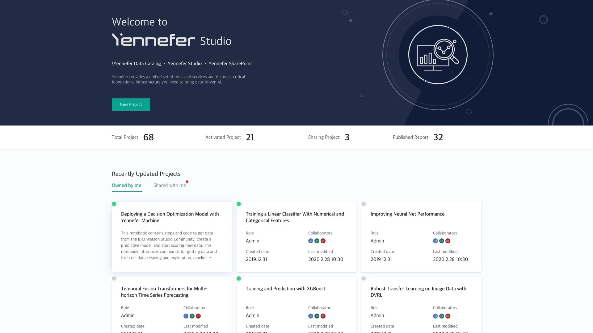
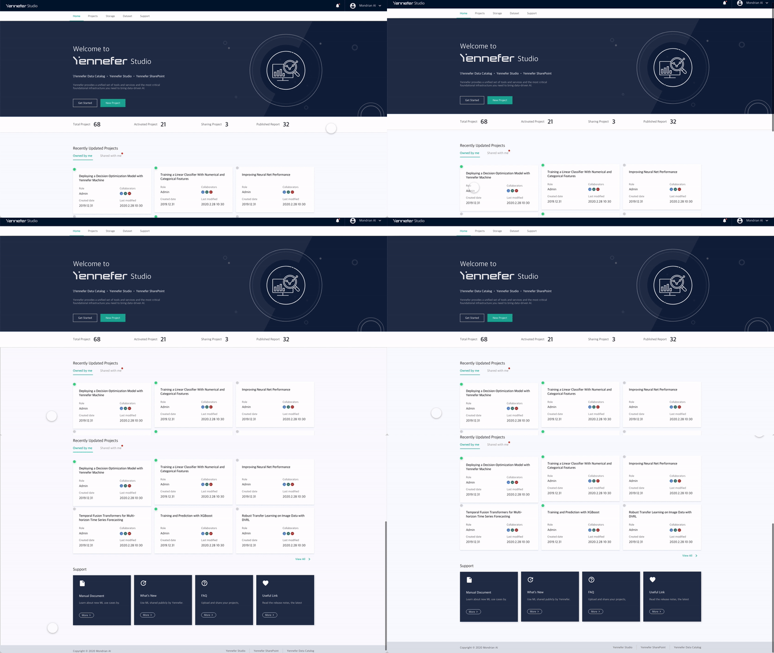
Yennefer Studio Main page
2. Quick Scan for Project Status
We designed Studio’s main page with highly prioritized features based on user research insights.
These features include access to other Yennefer platforms, creating new projects, and managing the projects.
Moreover, users can easily access project overviews, recently updated projects, and technical documentation.
Before
The previous main page had irrelevant, redundant, and disorganized information. For example, profile information is at the top which is not where users would expect to find it.
After
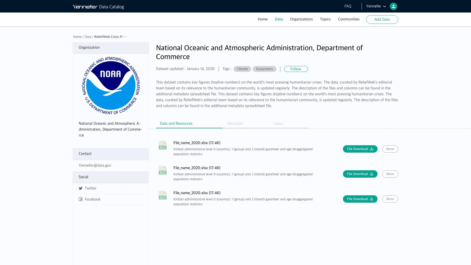
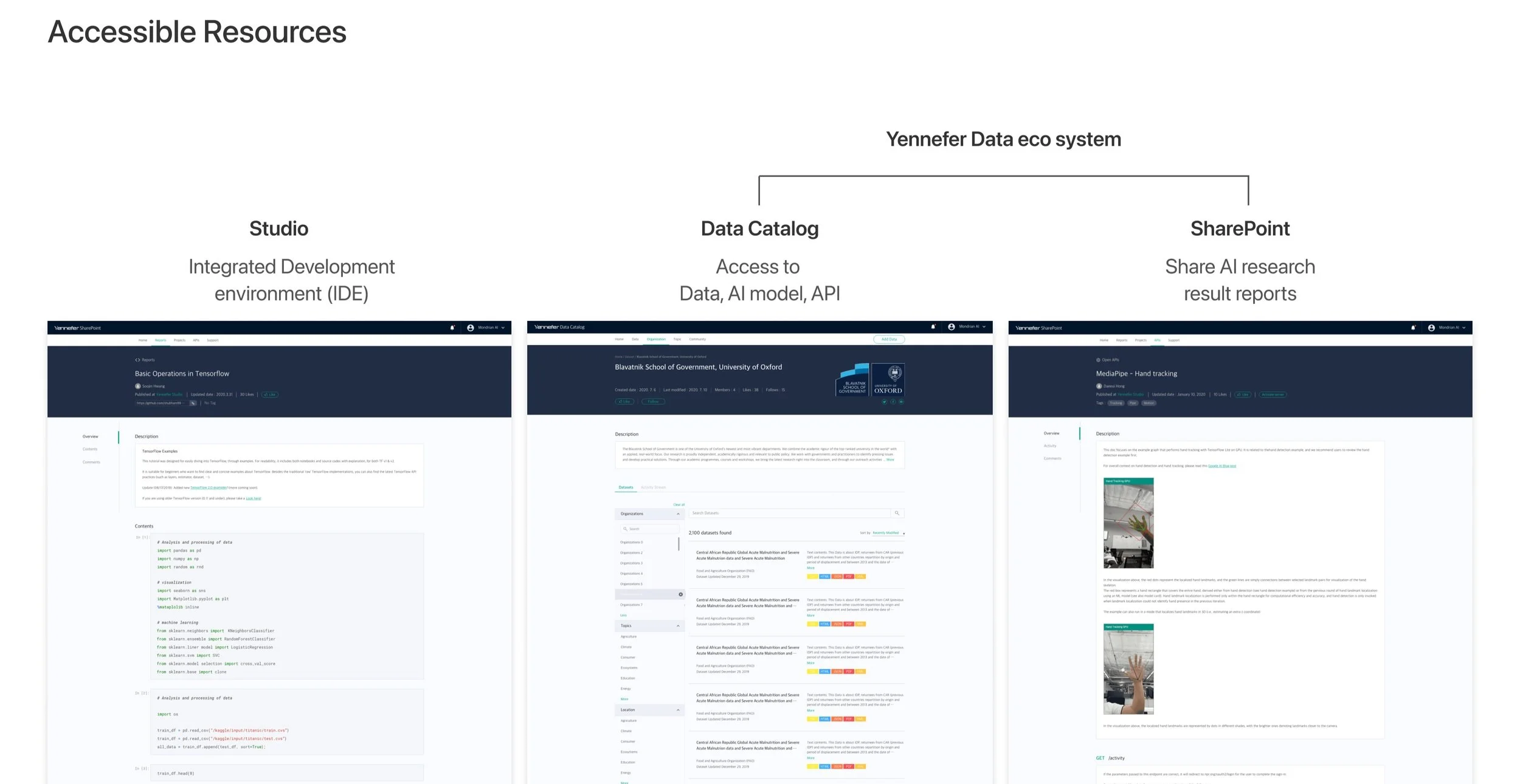
Yennefer Data Hub
3. Instant Access to Data
Participants mentioned the importance of being able to quickly access resources.
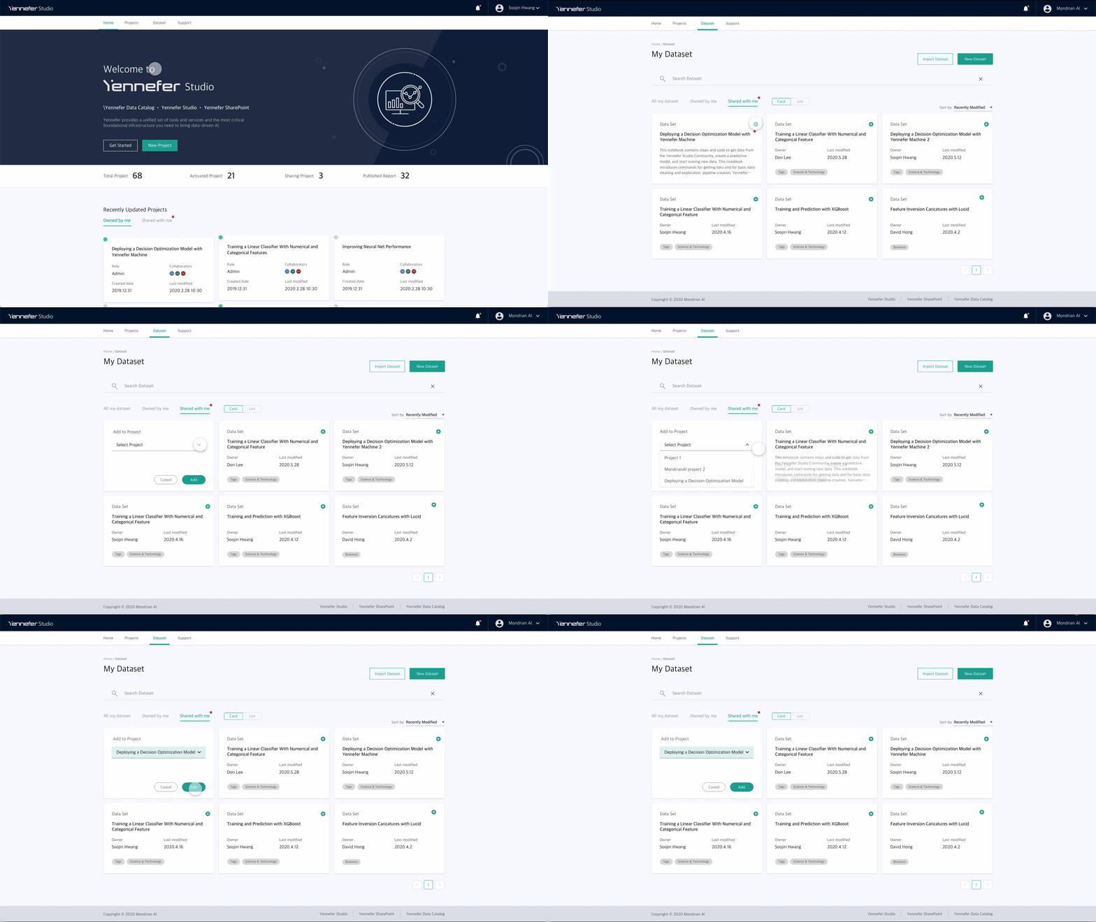
We designed the Data Catalog and SharePoint that help users access the data set and manage the individual and corporate data.
These seamless platforms are connected to each website so easy to interoperate and interact.
It helps collaboration with teams, departments, and partners be more visible and understandable.
Yennefer Data Catalog
Data as a Service; Data Asset Management expertise; systematically manages and shares your valuable data.
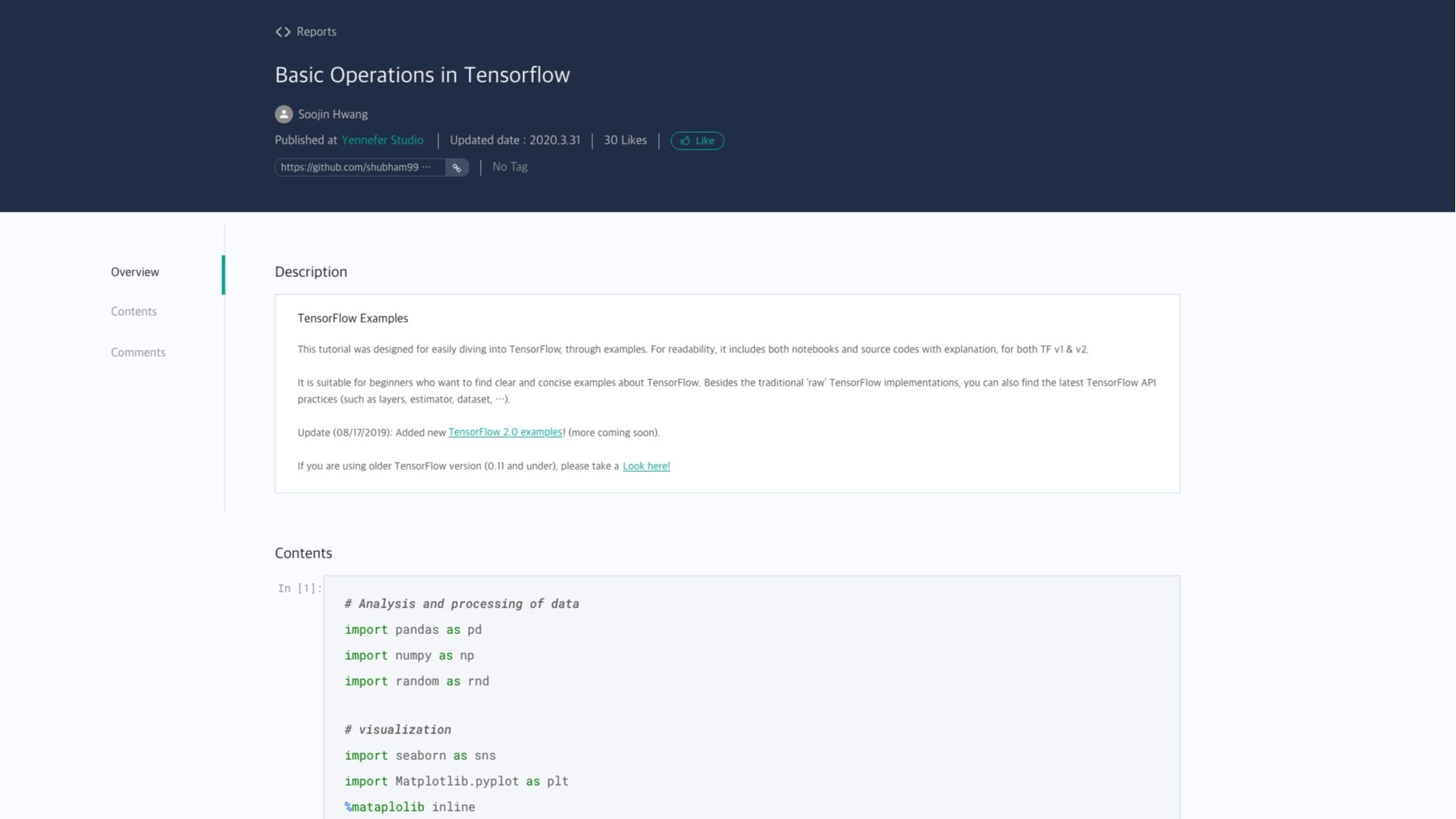
Yennefer SharePoint
AlaaS (AI Model as a Service); Share AI projects and reports; therefore, easily deploy AI services
Virtualizes on a project-by-project basis to share the entire process from data, code, and development to model deployment. This provides transparency in analysis and algorithms because it is released in a reproducible manner.
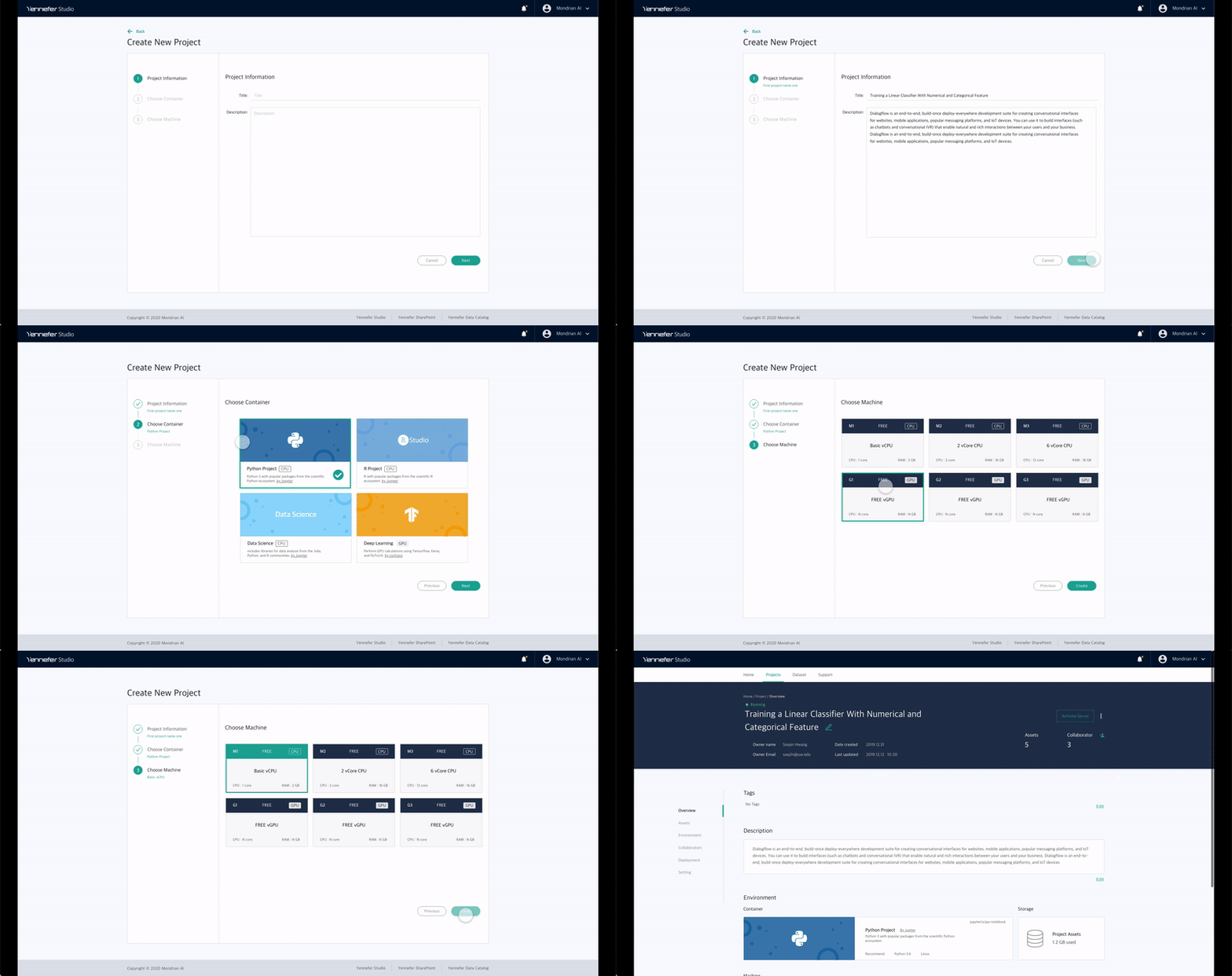
Project detail
4. Information Hierarchy
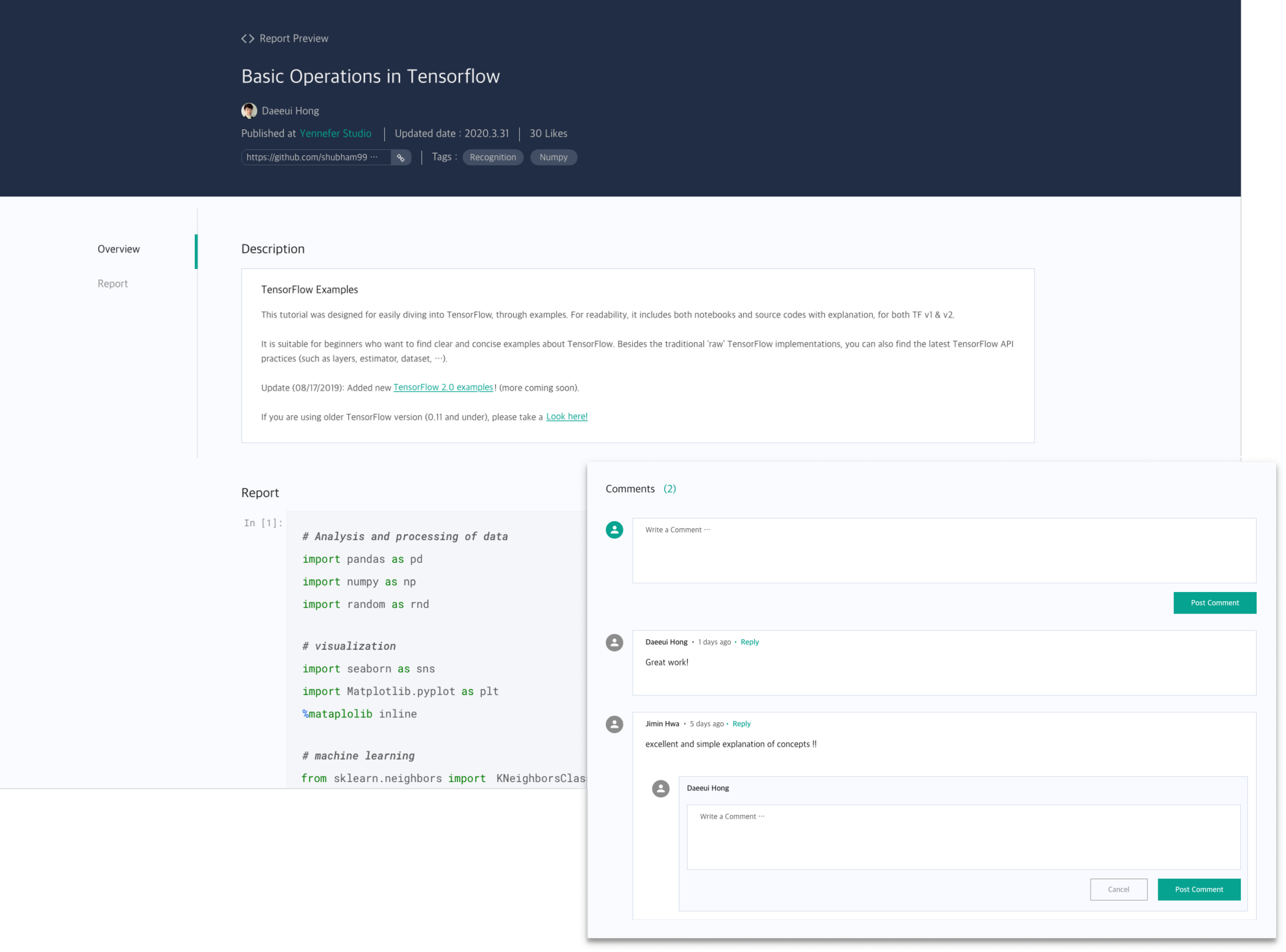
We created the project detail with relevant information to help AI developers improve work efficiency.
This information includes an overview, assets, environment, collaborators, deployment, and setting.
Product Launch Results
Yennefer Suite was launched and is currently being used at 5 enterprises and 3 educational organizations.
Such as Samsung Display, KT Telecommunication, Hyundai, Seoul National University, and SUNY University.
Yennefer Suite applied Data Science lab in Seoul National University Department of Statistics
3 Educational Organizations
5 Enterprise Organizations
Key Learnings
-
Communicate with stakeholders
Greatly Improved written documentation and communication skills. Especially, I learned how to collaborate and communicate with developers for better work efficiency.
-
The art of being consistent yet flexible
-
The challenges of designing at scale
Designing at scale comes with many constraints. For example, define each service and feature for each platform (Admin, Data Catalog, SharePoint). Moreover, it took time and effort to understand different stakeholders’ requirements and reach alignment. It was a humbling experience to learn that sometimes things take long for good reasons.
